Major Site Update: New User Interface - Now with Charts!
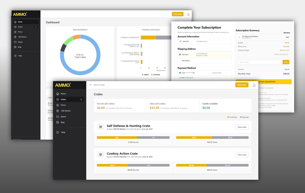
When we launched the new 2.0 version of the site in February, we didn’t have a lot of time to focus on the aesthetics - we just needed to get the darn thing out. So it didn’t look as good as it could have. This new site update will change all that.
This “facelift” rolls out a cleaner interface, better navigation and (drumroll please) CHARTS and GRAPHS of your ammo holdings. (For a data guy like myself that’s a great new feature!)
The plan is to roll out the new site update on Wednesday, July 7th - AFTER the busy 1st of the month and holiday weekend. Certainly NOT on a Friday afternoon like we naïvely launched the last major update… yikes! Oh well…. live and learn, right?
Functionally, the new site will work pretty much the same as the current site, because it has all the same plumbing - just a new exterior. We’ve improved just about everything with an eye on making the site more intuitive, easier to use, and to address questions or issues we had come up in the 2.0 version.
So let’s take a quick walkthrough the new sections:
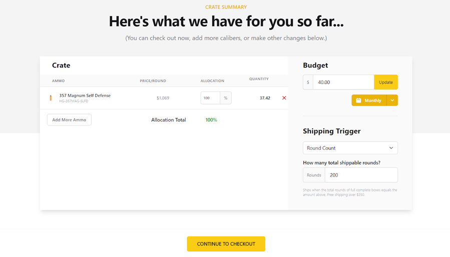
The Crate Summary Page will be clearer and more straightforward:
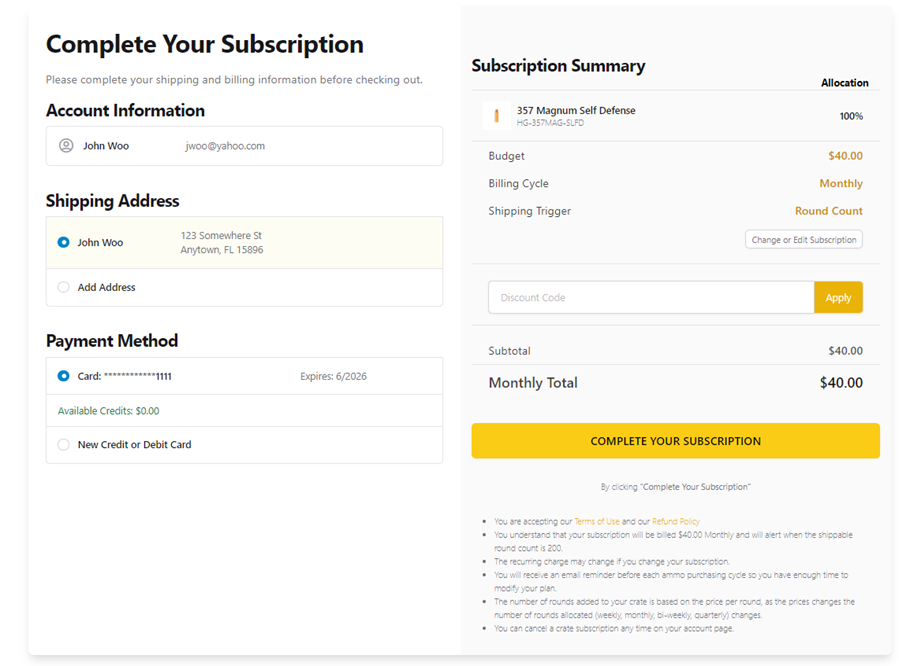
On the Confirmation Page, you’ll have an Address Book with multiple addresses and the ability to add multiple Payment Methods (credit cards for now, but in the future our plan is to add ACH and even crypto currency). So, overall checkout should be much smoother:
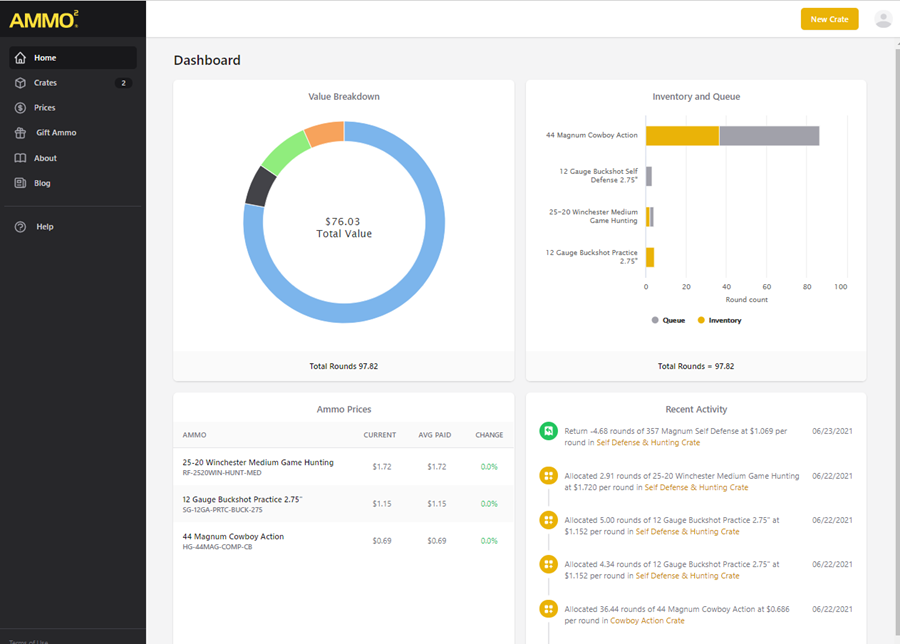
You’ll have a new account Home Page that will combine all of your holdings into one set of data. You’ll now see the Big Picture of your account on one page. This is something that folks have been asking for: a way to see ALL of their ammo - both Queued and Inventory in one place. This is that page:

You’ll also have a summary of Recent Activity, Ammo Price Changes, and the Average Price of your Inventory compared to the Current Price. Oh, and the graphs are hoverable and give more data when you hover or click on them.
Of course you will be able to see a Crate Summary as well. Like today, you can name your crate whatever you like. Here we have two crates: “Self Defense & Hunting Crate” and “Cowboy Action Crate”:
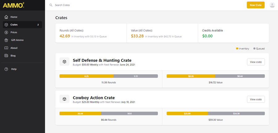
The Inventory is in gold and Queued ammo is in grey. At the top are your combined totals in number of rounds, dollars, and account credits are in green.
When you open your Crate Page, you’ll have a similar look and feel, but on a granular level for that crate:
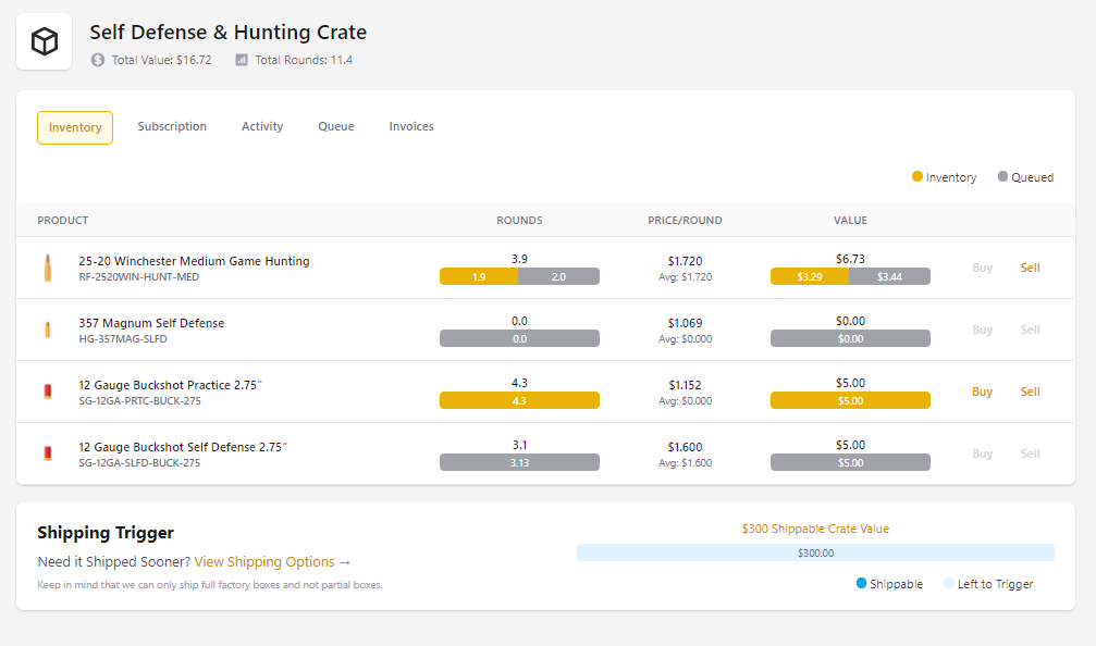
Each line will show the rounds you have in Inventory and Queue for each caliber along with other vital information - like the average price paid and whether you can buy or sell that caliber. There is even a sweet new Shipping Trigger indicator in blue at the bottom, to show how close you are to your shipping trigger!
The Crate Subscription Page also had a good makeover. Now it is easier to adjust your subscription by adding or removing calibers, or any other element of your subscription, for example: percentage allocations going to each caliber.
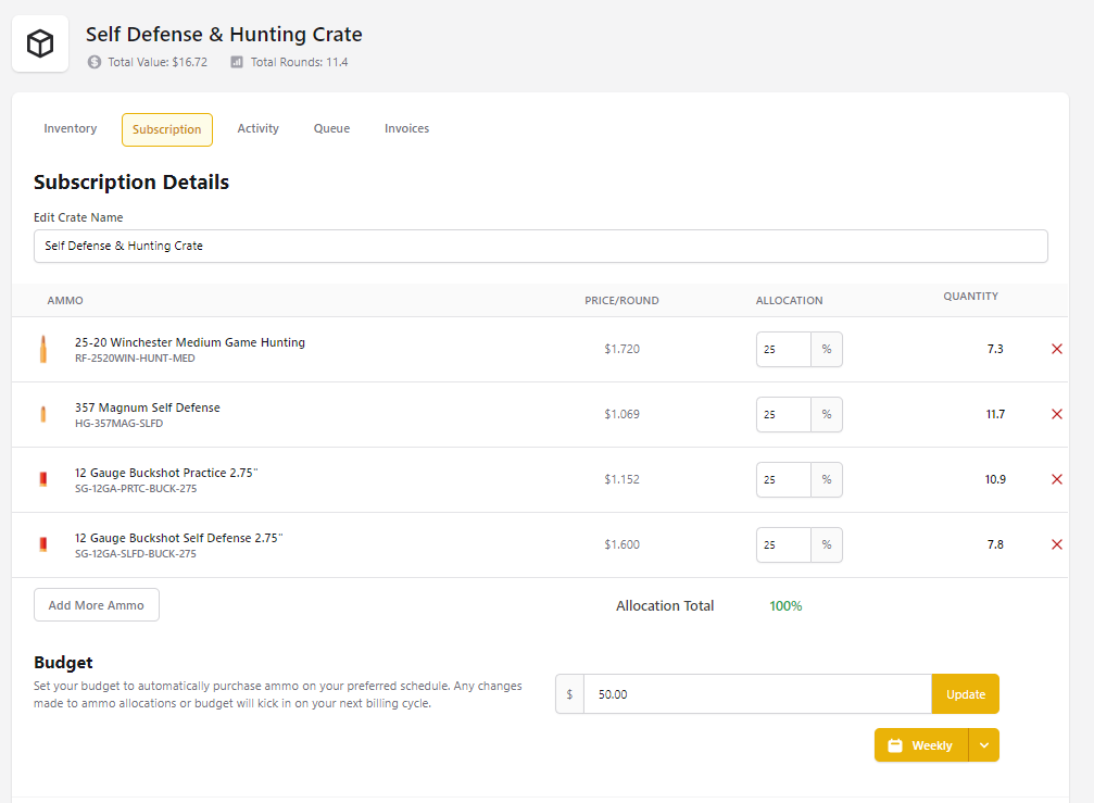
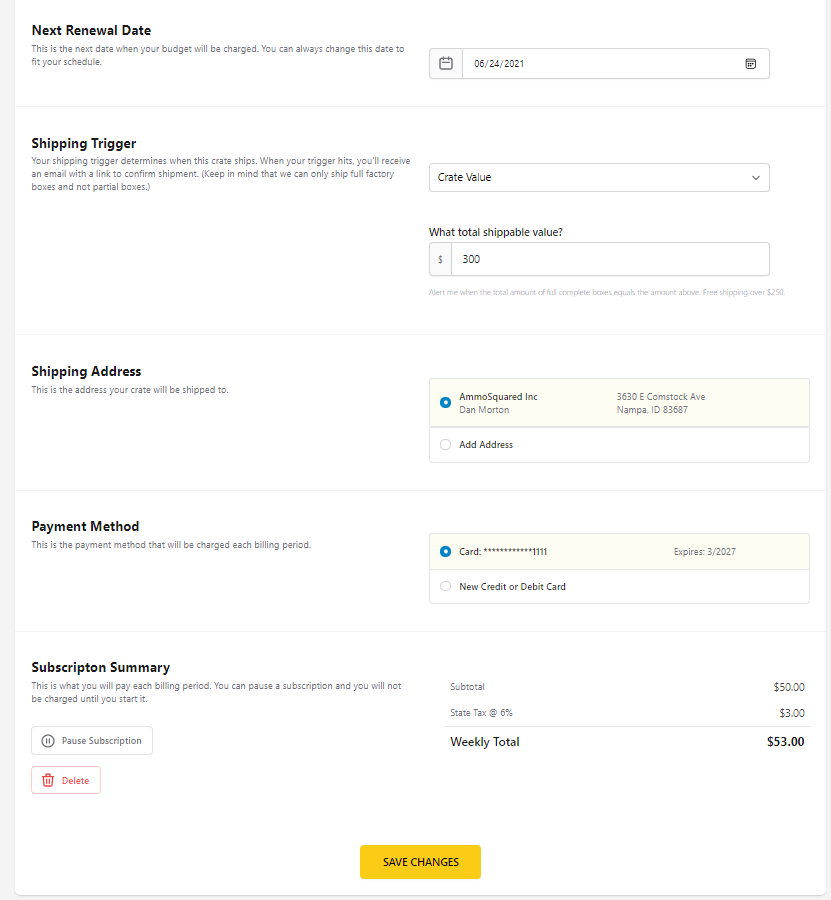
Most of this page will be pretty self explanatory, but we made a new useful change by adding a simple “Pause Subscription” button at the bottom instead of the previously confusing feature to pause individual caliber allocations. You won’t be billed while your subscription is paused and you can have it paused as long as you like.
The Crate Activity Tab is now color coded with more useful information:
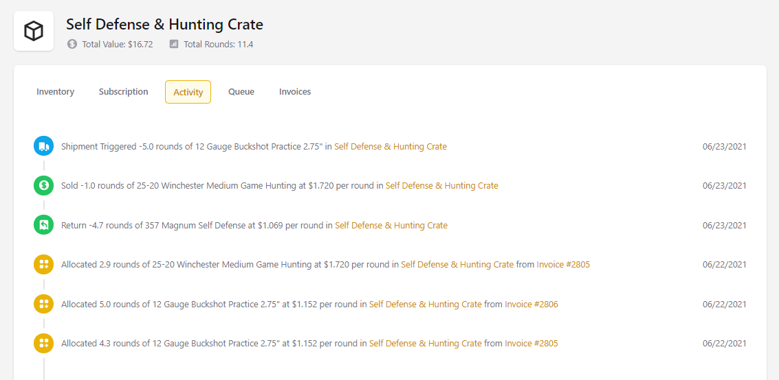
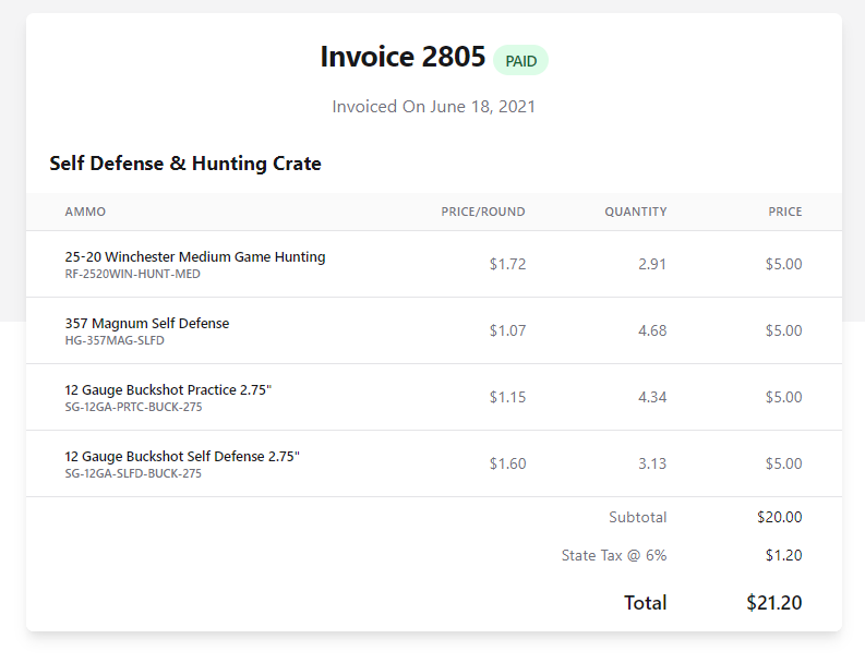
Another improvement we added, was the ability to easily tie your queued ammo back to a specific invoice. Now you won’t have to wonder where that ammo came from (or went). Each line item in your queue will have a clickable invoice number that takes you directly to the (now improved!) invoice:
Queue Tab:

Invoice Tab:

Sample Invoice with more information:
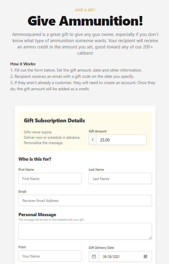
Finally, the last feature I want to highlight is the ability for existing customers to give AmmoSquared GIFT AMMUNITION! The best part is, you don’t have to know what calibers the other person wants - you just decide on how much you want to give, and the other person gets an email with a sign up code and an account credit they can use toward any of our 200+ calibers…
Here is how it will look:
So that is all for now.
The site redesign will go live on July 7th! We couldn’t be more proud of this improvement. It is 10x better than the current version and 100x better than what we originally launched with nearly 6 years ago!
Onward and Upward!
Dan
